Website builders can feel like a dime-a-dozen. But there are some out there, such as Elementor, that can make life a lot easier.
They do so through Essential Addons that can help your website stand out from the rest out there. But which addons are the ones for you? How do you know which ones to choose among the litany of options out there? This is your guide to elementor: choosing the right addons that can help your website grow and look exactly like you always imagined.
Interactive Promo
You can’t talk about Essential Addons from Elementor without mentioning interactive promo. This is the perfect widget that allows users to decorate their website as they see fit all with the awesome promo effects.
This means inserting content and style where they want, depending on their choice. It can mean creating a website that is truly unique to their vision and drives the look and feel that they were hoping to achieve in their website.
One-Page Navigation
Bigger is not necessarily better. While we may have the vision of a huge, comprehensive website where users can find anything that they are looking for, that does not necessarily fall in line with what the purpose of a business may be.
But with essential addons such as one-page navigation from Elementor, you can keep it short and sweet. This widget means creating a website that is just one page but flows effortlessly. Best of all, it only takes a few clicks to create. If you are looking to time your website launch but not compromise on appearance, the one-page navigation is a great place to start.
Image Comparison

Another cool feature that Elementor offers is the image comparison widget. What does it do? Well, potential buyers can compare between two different images. For design websites in particular, that can mean the difference between generating a sale and not quite producing the vision that the user had hoped to achieve.
It maintains perfect image resolution for both images, allowing for an effortless comparison. It is a great tool to give to users to see the difference between what they have and what they want or between two options that they are choosing. Besides, it is not something that you will find on every website.
Filterable Gallery
There is something to be said about a good image gallery. One of the essential addons offered is just that: a gallery that is filterable all in the form of a widget. Your website can showcase all of the images that you want and do so with crystal clarity.
Even better, users can organize these images by whatever layout option they choose. It is a great way to feature certain products or items that you want to stand out while still giving the consumer the ability to filter as they see fit.
Image Scroller
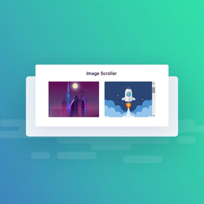
Images can all start to feel the same after a while. But there are more features coming out that can help them to stand out among the rest out there. The image scroller is one of those cool and effective features that can help you achieve something different.
The scrolling effect is applied to images, which can make them feel far more interactive. That touch of interactivity can be enough to make your website stand apart from the litany of others out there. Besides, there is nothing like seeing an image come to life in the way that an image scroller can make happen.
Countdown

Part of driving sales is making the consumer feel like they have to get in on that deal right now or miss out forever. So, what way to better inspire them than by adding a countdown timer to a certain product or web page?
That timer includes a custom countdown timer that can drive a sense of urgency and encourage action on the part of the consumer. It is a great way to boost sales because it can make the consumer feel like they can’t miss out on that item. Even better, you can customize the countdown to fit seamlessly into your page.
Divider

Sometimes, for a website to be effective, there are little design implementations that go a long way. When it comes to the overall look of a website, having one endless scroll can feel like a never-ending story. This is why a little division can go a long way.
The divider widget is a great way to provide a little bit of space. But instead of just adding space, it can be images or text that fill the space to continue delivering the overall message of the website. No wasted space, no wasted messages, just an effective method both visually and functionally.
Fancy Text
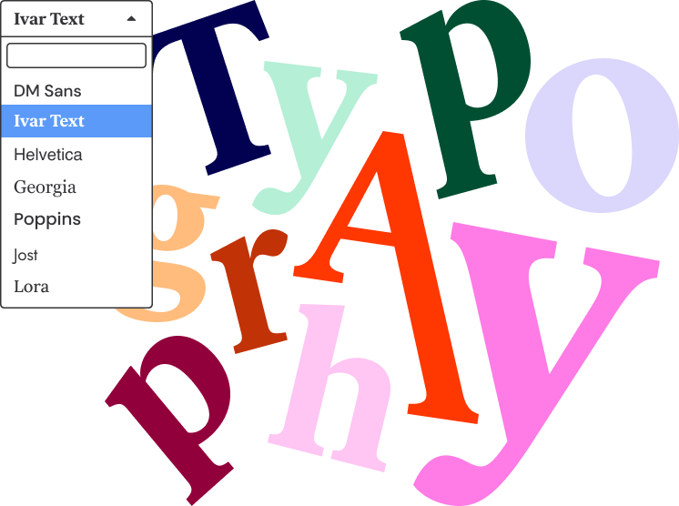
Interactivity is crucial for standing out as a website, no matter the business that you are in. The fancy text widget is an easy way to stand out in a crowd. It lets users add animation into their different text types, bringing life to simple words.
There is even an advanced features setup, which allows users to choose from different animations, set up speeds that work for their specific animations, and so much more. There is nothing inexpensive-looking about a custom animation for your text. More importantly, it is the kind of feature that jumps out off the page and draws the end user in.


